Using data from The New York Times (NYT), as provided by Edison Research.
Select a state:
Data is loading... Please wait.
Certified Presidential Election Results
| Candidate | Votes | |
|---|---|---|
| {{ entry.name_display }} | {{ entry.votes.niceFormat() }} | {{ entry.percent_display }}% |
| Total | {{ president.votes.niceFormat() }} | |
Ballot Counting Time-Series Chart
The following chart shows the progression of ballot counting for the Presidential race, beginning on November 3 and continuing over the following days. Some odd discrepencies appear in some states that deserve further investigation.You can compare multiple states by opening separate browser windows.
| Legend | |
|---|---|
| Black | Estimated percent of ballots counted (eevp) |
| Green | Total number of ballots counted |
| Blue | Percentage of votes for Democrats |
| Red | Percentage of votes for Republicans |
| Thanks to UnderstandingEdison.us for developing this interactive chart. | |
It's expected that we would see high volatility in the red and blue lines at the start of the counts, and a smoothing effect towards the end. This is due to the fact that earlier batches of ballots have a greater impact on the cumulative margin than the later batches.
Read Understanding the NYT Data for more details on the low-quality data provided by NYT and common pitfalls.
If you spot unusual anomalies, discuss them in the comments below.
Secondary Ballot Races
Results by County
Coming soon.
Raw NYT Time-Series Data Files for {{ currentStateName }}
The following JSON data comes from the New York Times, and appears to be a transformed subset of the paid data stream from Edison Research, combined with a few entries from the Associated Press. The numbers for ballot batches are low-resolution in that they are only given in percentages and rounded to three decimal places (there's no exact ballot counts, except for the final result). If there are any instances where the data does not match the Secretary of State's final certified results, the SoS data should take priority.
Read Understanding the NYT Data for more information on common pitfalls.
The NYT does not provide CSV files of the data, but you can generate CSV files below if you find these easier to work with. These contain only a core subset of the JSON data.
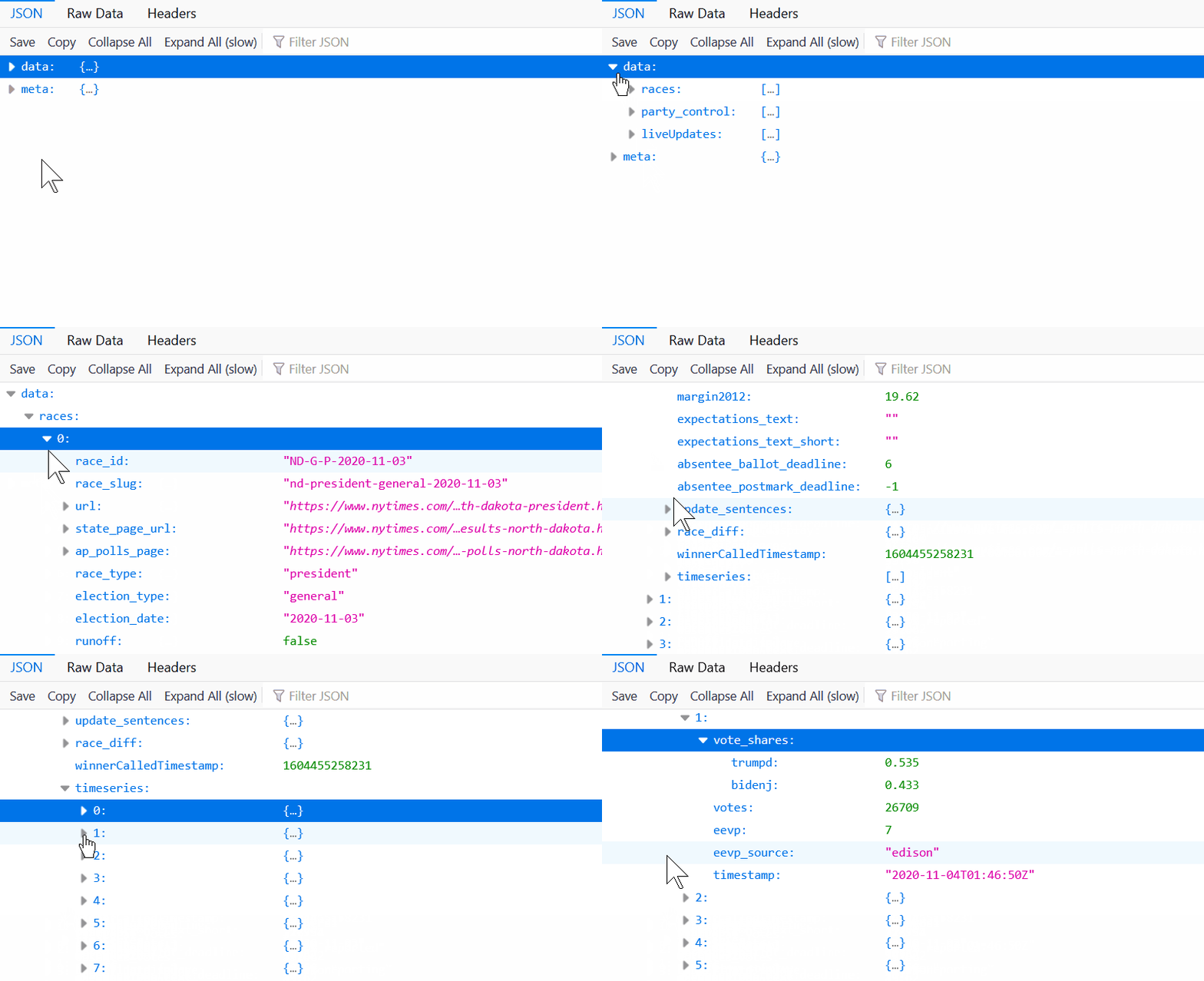
We recommend the Firefox browser for exploring JSON data as it has a simple tree interface for drilling down into the data as well as keyword search. See example:

Download
| Type | Granularity | Includes timestamped batches | Download links |
|---|---|---|---|
| All Ballots | State Level | ✅ | JSON Format |
| Presidential Ballots (by batch) | State Level | ✅ |
JSON Format Raw CSV Format Enhanced CSV Format * |
| Presidential Ballots | Precinct & County Level | ❌ |
JSON Format
Raw CSV Format |
|
Presidential Ballots
"Concatenator" File |
Precinct & County Level | ❌ |
JSON Format
(This JSON file appears in a different structure and may include extra data. It appears to only be available for Florida, Michigan and Pennsylvania, for some reason.) |
Researchers may also be interested in obtaining previous versions of the JSON data to verify whether NYT or Edison made later modifications to the result feeds. Some of these are available in the Wayback Machine. Perform a search for the JSON URL to see if archived copies are available. See example. Once you've downloaded an earlier version, we recommend applying "pretty formatting" to both JSON files and then comparing them in a visual diff tool like WinMerge to compare the differences. Let us know if you detect any anomalies.
* In the enhanced Presidential ballot CSV files, the first 9 columns are the exact values as supplied by the NYT feed (as in the raw CSV), but the subsequent columns are some additional calculated values which are useful in seeing the changes (sometimes called deltas) between batches. Unfortunately the NYT percentages are rounded to the nearest 0.1%, and when extrapolating this out to hundreds of thousands of ballots, it can sometimes introduce anomalies in the calculations such as seeing more negative ballot numbers than is to be expected (yes, there are some strange negative values which may require investigation, but possibly not as many as you're seeing in the CSV). We're working on ways to normalize these, but in the meantime, be aware.
More charts and tables may be coming soon, as our volunteer developers are able. Stay tuned, and follow us on Telegram to get notified.
Further Data Sources
We aim to publish links to both the raw election data and voter registration data for so that citizens and researchers can analyze this information for themselves.
Election Data Analyzer Tool, for Canvassing Voter Registrations
USEIP is currently developing a tool that takes voter registration data, combines it with maps, analyzes it for issues such as large numbers of people at a single address, and helps focus canvassing efforts on areas with the most irregularities.
Learn more about the tool via this Rumble video or from their Telegram Channel. It’s supported by USEIP.org.
Visitor Comments
Have an idea for a chart or graph that you would find useful here? Let us know in the comments below.